Artwing Studios is a creative digital agency focused on curating bold visual stories for brands across social media and digital platforms. With a reputation for imaginative storytelling, Artwing sought a digital presence that could capture the same energy it infused into its client work.
The challenge was to design a website that reflected both the agency’s creative ethos and its practical professionalism. It had to balance bold aesthetics with seamless usability, ensuring that visitors — from potential clients to collaborators — experienced Artwing’s creativity without friction.
01.
Problem
No website, no anchor.
While Artwing excelled in storytelling for others, its own digital footprint was limited. The absence of a strong website meant the agency lacked a centralized showcase for its portfolio, services, and culture. This gap made it harder to translate social media success into long-term brand equity.
In an industry defined by first impressions, Artwing’s digital absence risked weakening credibility. Without a robust online home, its creative energy risked being scattered across platforms, lacking cohesion or the authority of a well-designed digital hub.
02.
Our Synthesis
Bold minimalism, maximum impact
We synthesized Artwing’s identity into a website concept that reflected its creativity while maintaining functionality. The solution was to build a bold yet minimal interface that emphasized storytelling, streamlined navigation, and strong visual accents.
The site would function as both a portfolio and a communication tool — an anchor point where creativity, opportunity, and client engagement converged. The synthesis placed equal weight on aesthetics and performance, ensuring the brand spoke with confidence across digital channels.
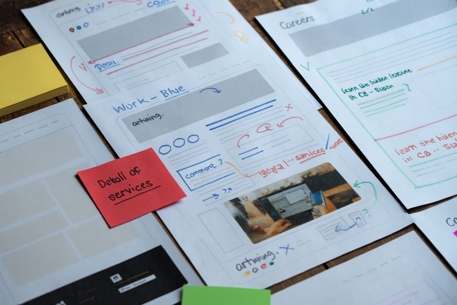
03.
Ideation
Black, white, and sparks of color.
Our ideation explored a black-and-white base palette, emphasizing minimalism, paired with vibrant accent colors that symbolized creativity. Design concepts highlighted bold typography, modular layouts, and interactive elements that echoed the studio’s storytelling ethos.
We also ideated on how different audiences would use the site — potential clients browsing portfolios, job seekers looking for opportunities, and collaborators seeking contact. Each idea reinforced the central principle: simplicity in function, boldness in feel.
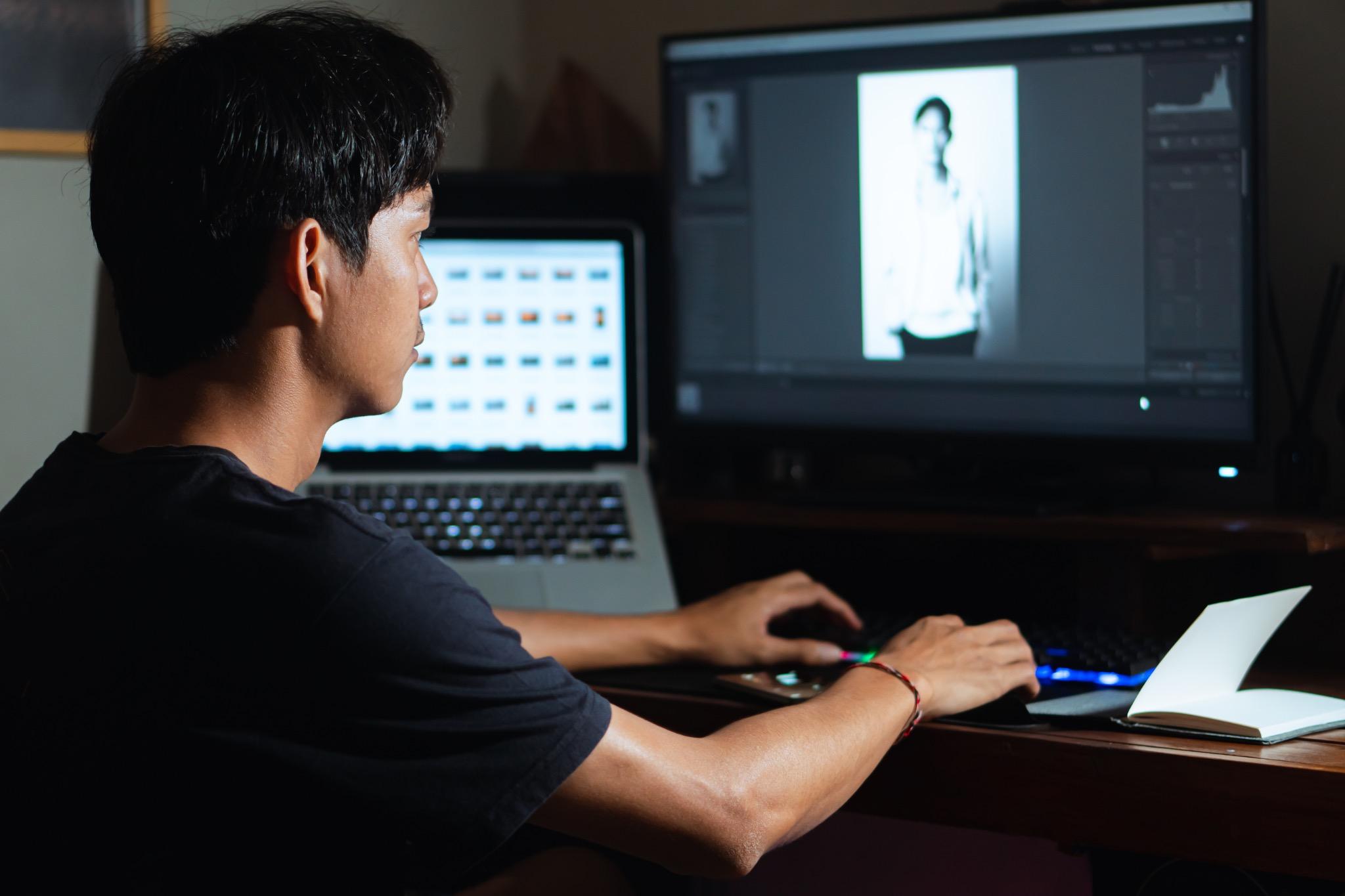
04.
Experimentation
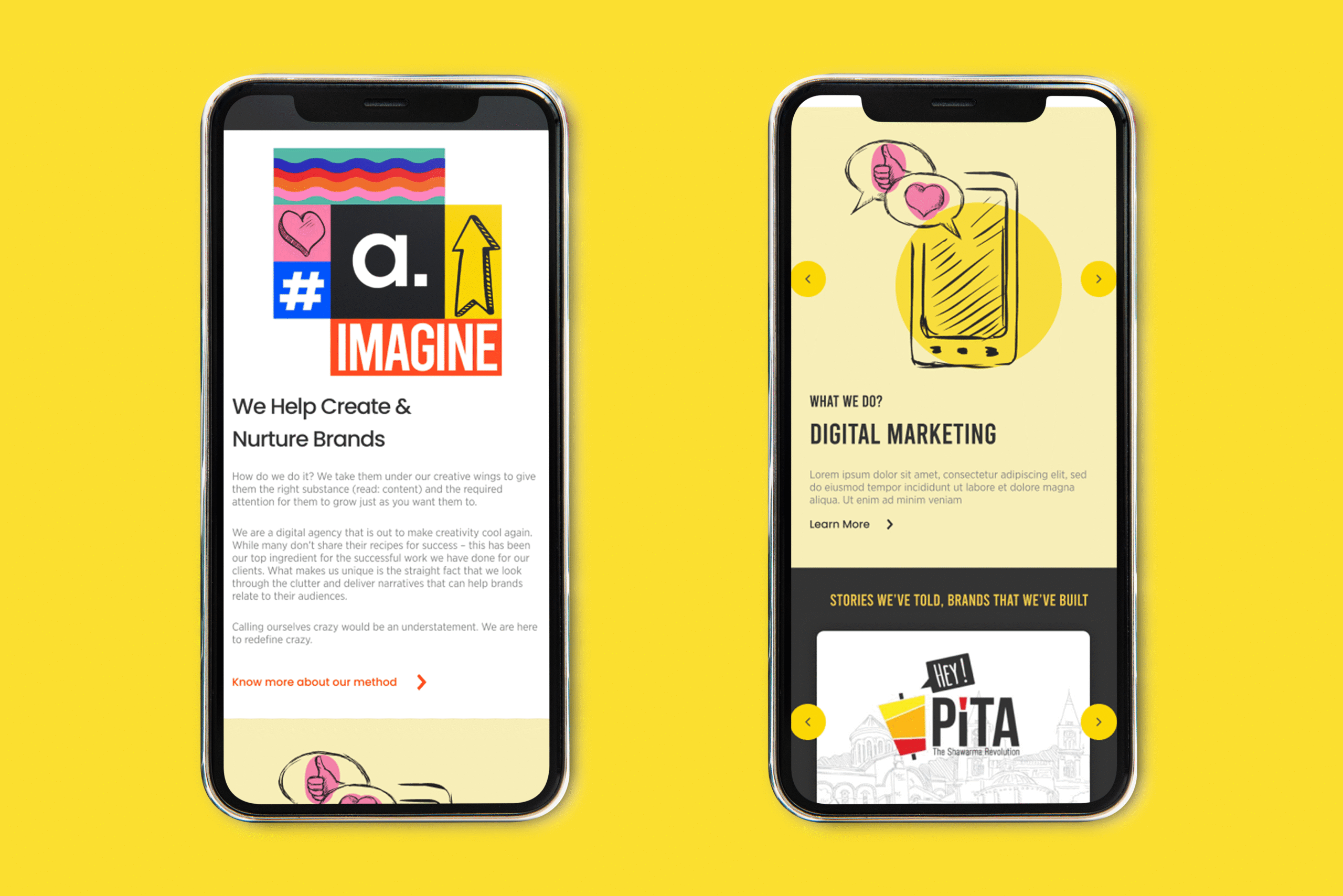
Responsive tests, pixel perfect
Prototypes were tested across web and mobile platforms to ensure flawless performance. Experiments focused on layout responsiveness, user flows, and visual balance. Each iteration was refined for speed, clarity, and user engagement.
The team experimented with accent color palettes, motion graphics, and micro-interactions to test how much creative energy could be embedded without sacrificing usability. Testing revealed the balance point where bold visuals enhanced rather than distracted from navigation.
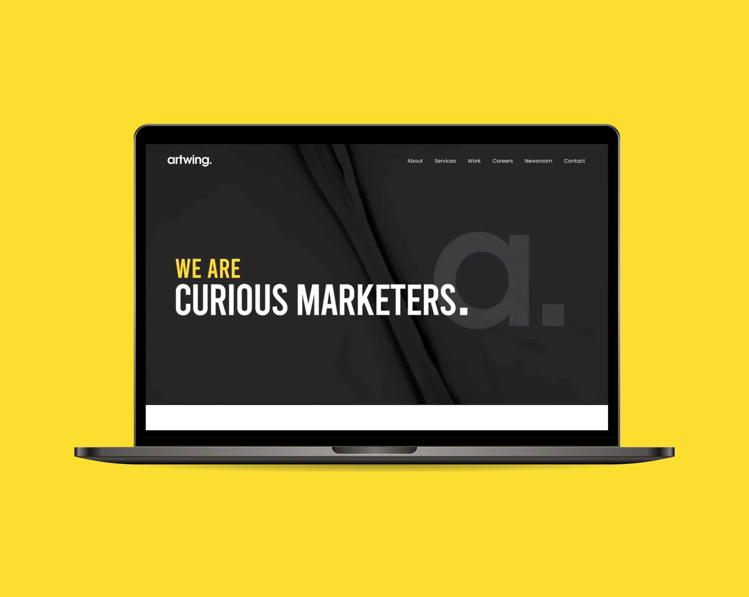
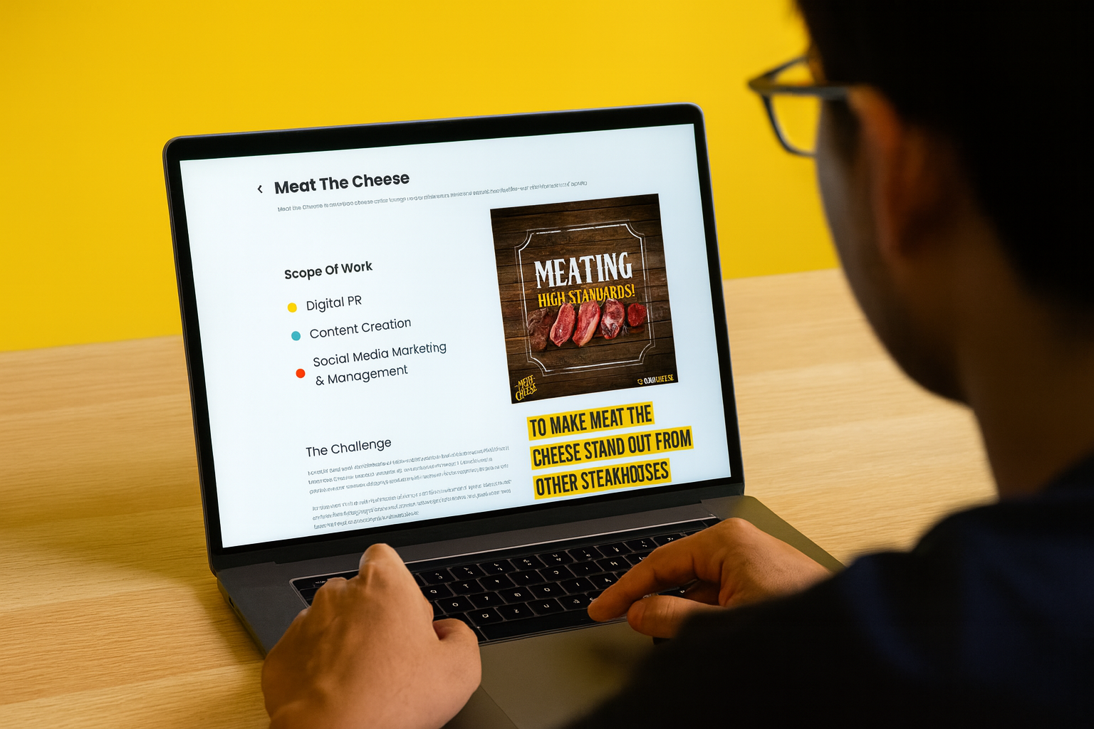
05.
Our Solution
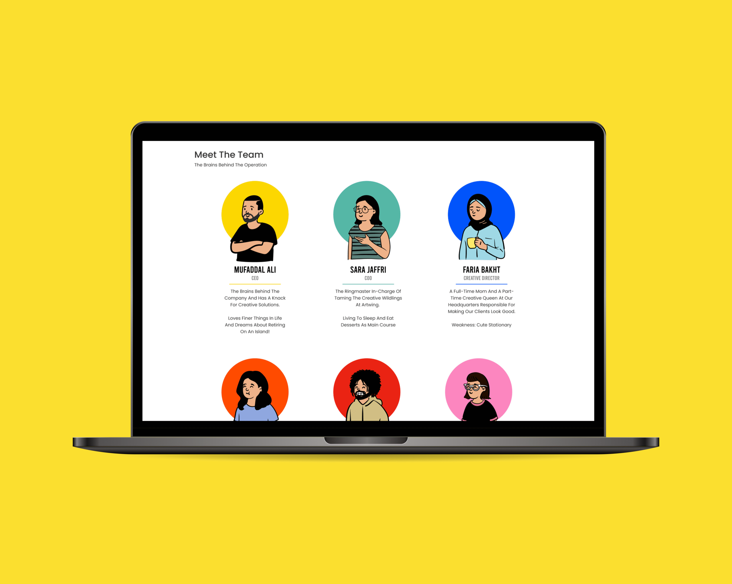
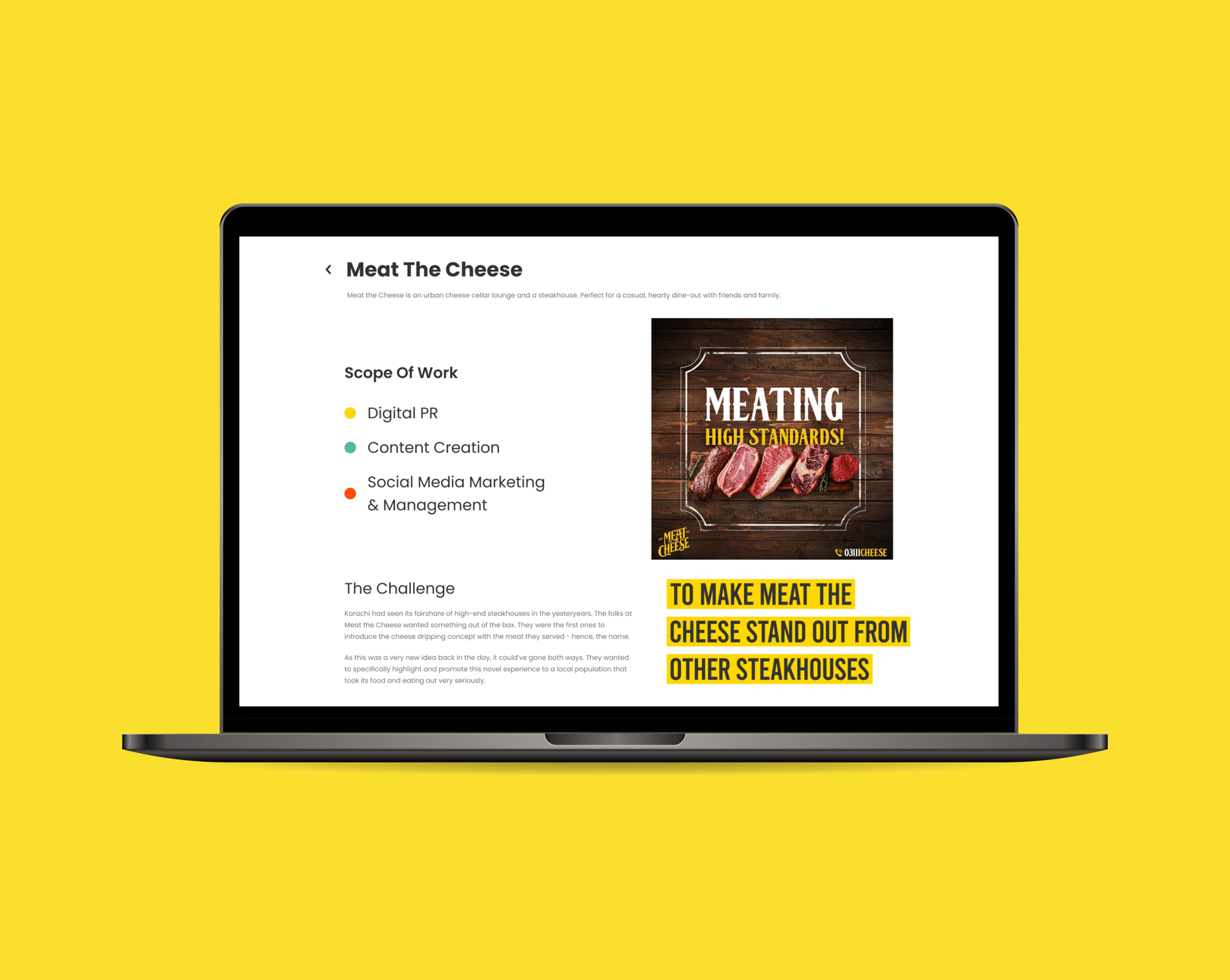
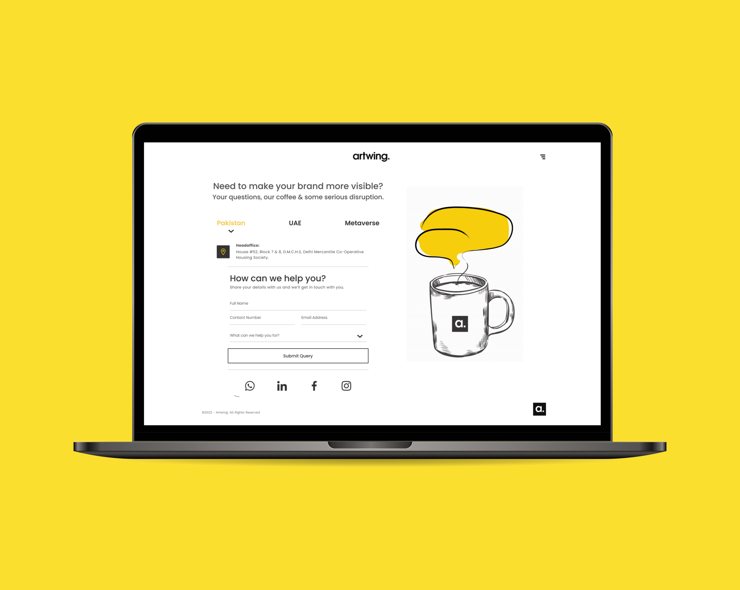
A digital portfolio with wings.
The final solution was a bold, minimal website that perfectly reflected Artwing’s creative identity. Black-and-white foundations provided elegance, while vibrant accents highlighted key content areas. The site was optimized for flawless performance across desktop and mobile.
It showcased portfolios, job openings, and contact pathways with intuitive clarity. The website became an anchor that elevated Artwing’s storytelling ethos, transforming its digital presence into a seamless extension of its creative brand.