Find My Doctor is a Pakistani health-tech startup that emerged as a vital connector between patients and doctors, especially during the COVID-19 pandemic. By enabling remote consultations and pharmacy integrations, it expanded healthcare accessibility at a time of crisis.
With rapid growth, the startup became a household name. However, to sustain momentum, it needed a refined user experience that reflected trust, efficiency, and simplicity. The challenge was to redesign an app that had grown organically but lacked a consistent and intuitive flow.
01.
Problem
A confusing, stressful app.
The existing app interface was cluttered and visually overwhelming, relying heavily on bright, harsh colors that fatigued users. Navigation was confusing, with unclear flows for consultations, follow-ups, and pharmacy services.
These inefficiencies risked undermining the brand’s credibility at a time when health-tech needed utmost trust. Without a cleaner, more intuitive system, users could grow frustrated, leading to reduced engagement and missed opportunities in an expanding healthcare market.
02.
Our Synthesis
Care meets clarity.
Our synthesis was to translate healthcare’s values — trust, care, and clarity — into digital experience design. By rethinking flows, simplifying interfaces, and refining aesthetics, we aimed to make the app both user-friendly and reliable.
The approach balanced function with empathy: every design choice had to serve not just usability but also reassurance. This synthesis positioned Find My Doctor as more than a digital connector; it became a trusted companion in navigating healthcare needs.
03.
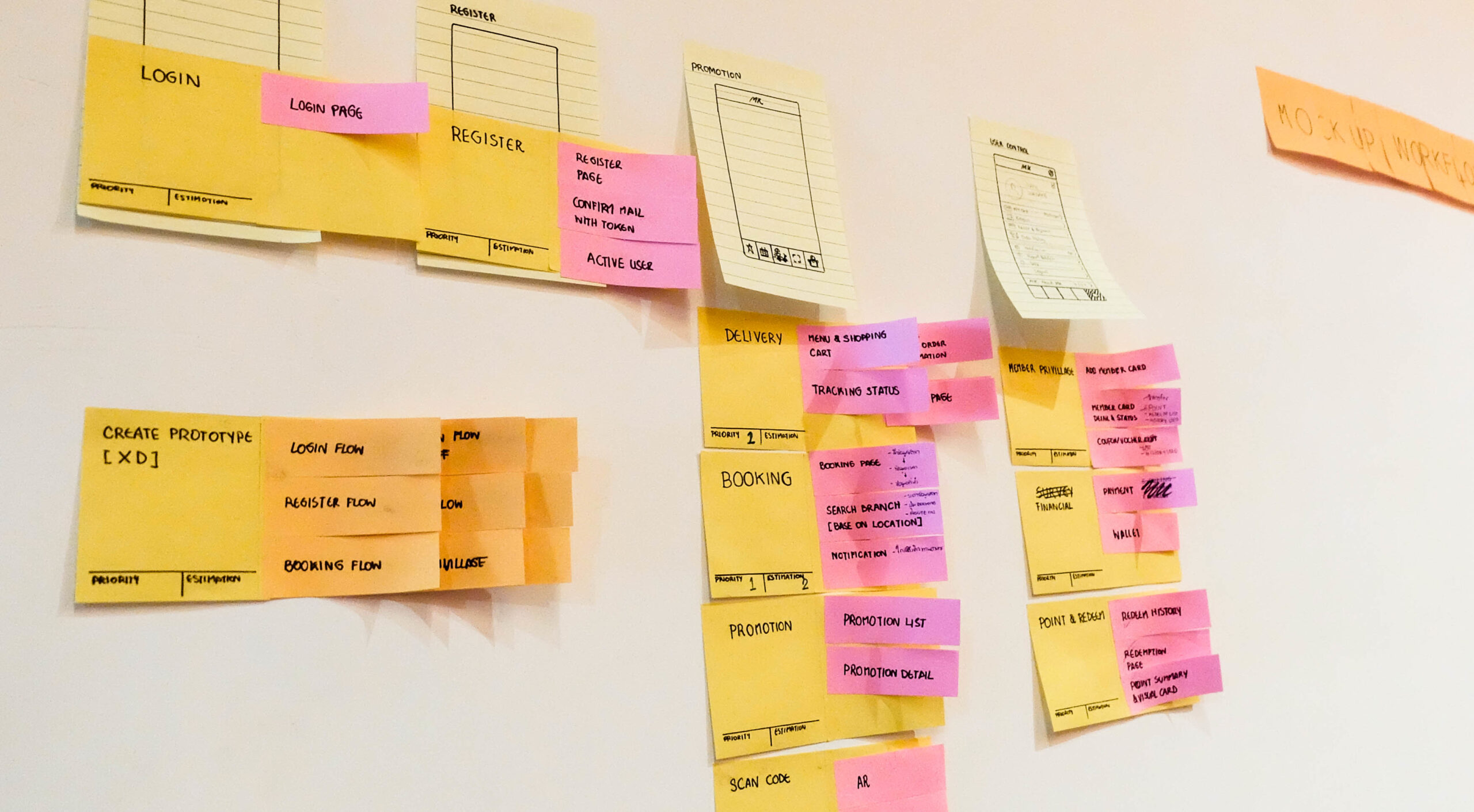
Ideation
Soft colors, simpler flows.
We began ideating around simplifying major user flows — from booking consultations to receiving prescriptions. Wireframes emphasized intuitive navigation, minimal steps, and clean layouts. Visual ideas included softer color palettes that conveyed calmness instead of urgency.
Narratives and microcopy were considered carefully, ensuring that communication within the app reflected empathy and support. The goal was to make the app feel less like a transactional tool and more like a partner in healthcare journeys.
04.
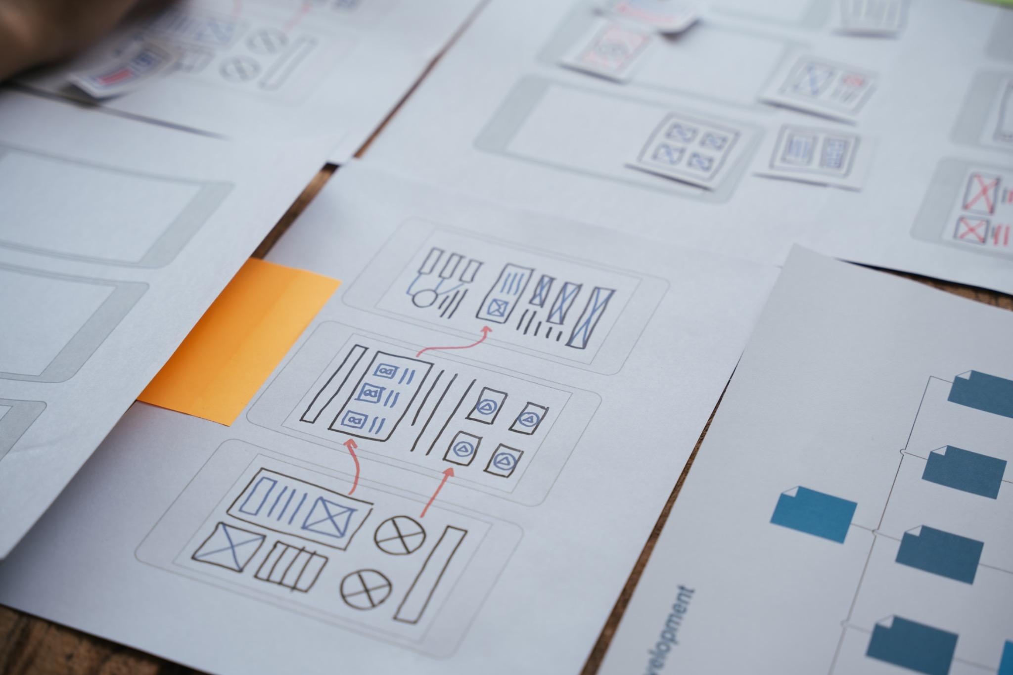
Experimentation
A/B tests for trust.
Prototypes were tested with real users to map behavior and pain points. Iterations addressed issues of clarity, particularly in service confirmation, delivery tracking, and follow-up consultations. Usability tests revealed opportunities to reduce steps and streamline navigation.
Experimentation also included A/B testing of color systems and visual styles. By comparing user feedback across versions, we refined the balance between professional trustworthiness and user comfort. The iterative process made the redesign both empathetic and efficient.
05.
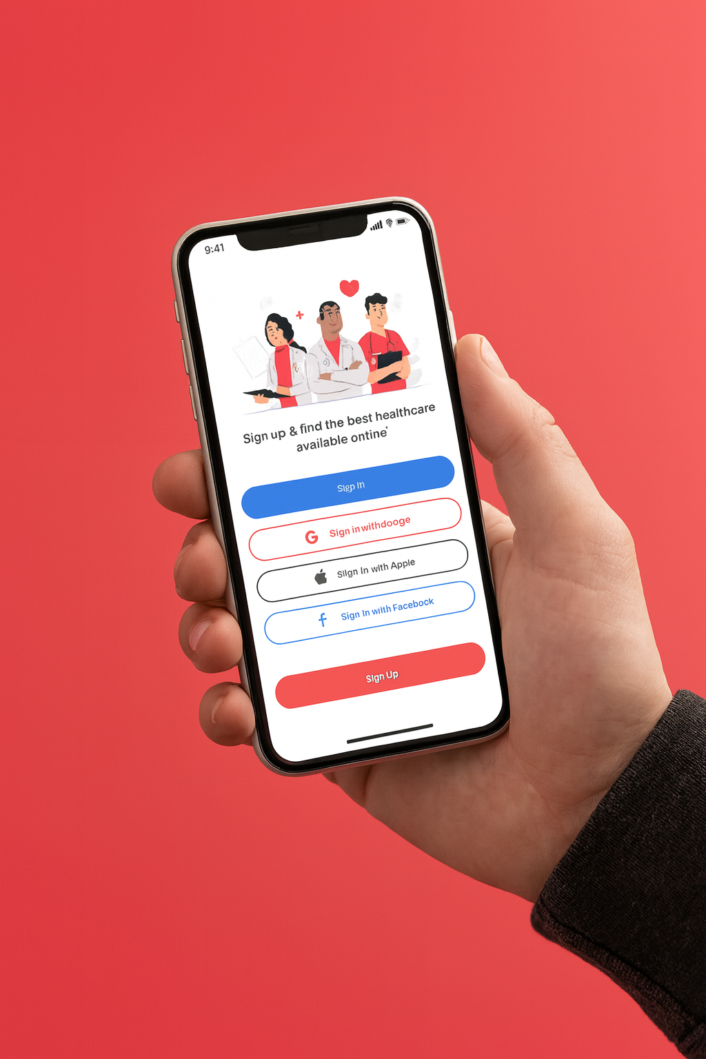
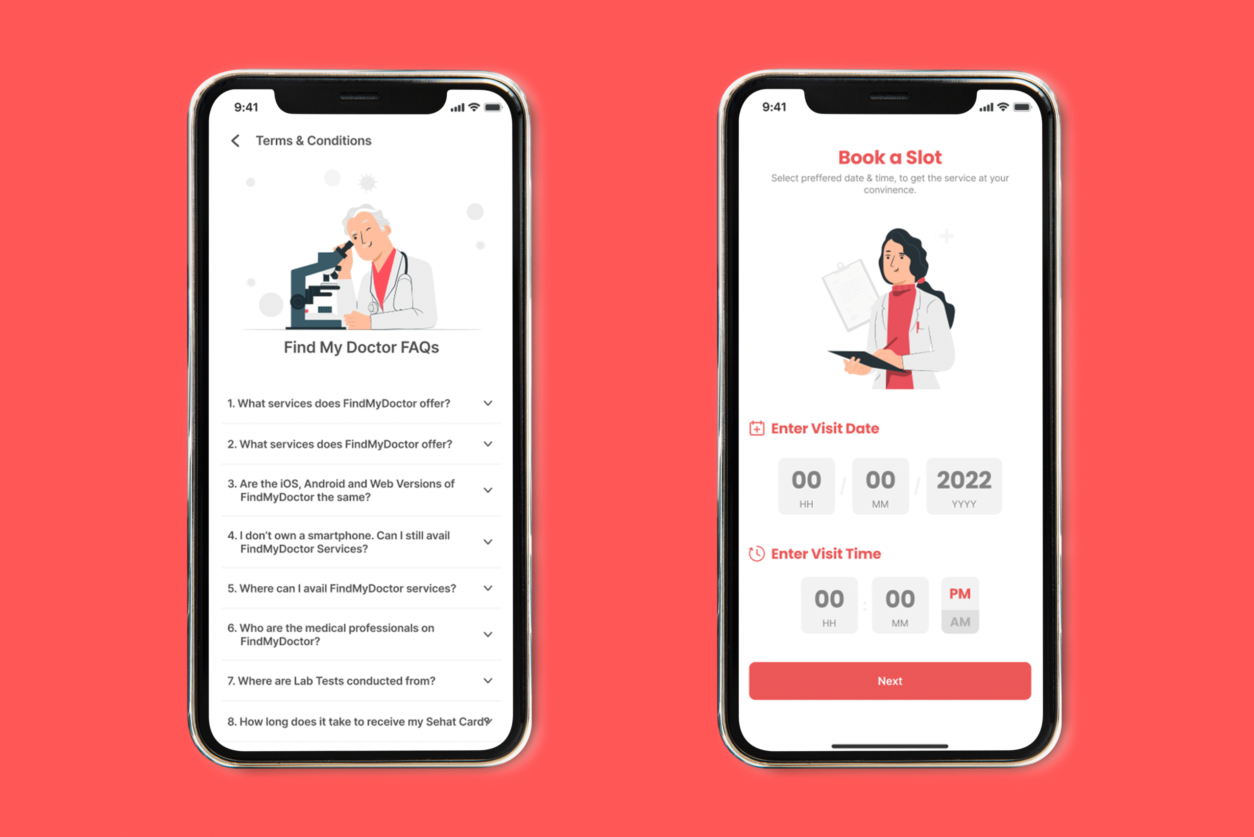
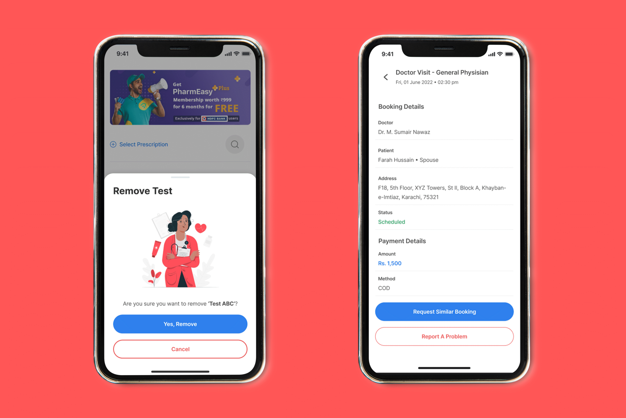
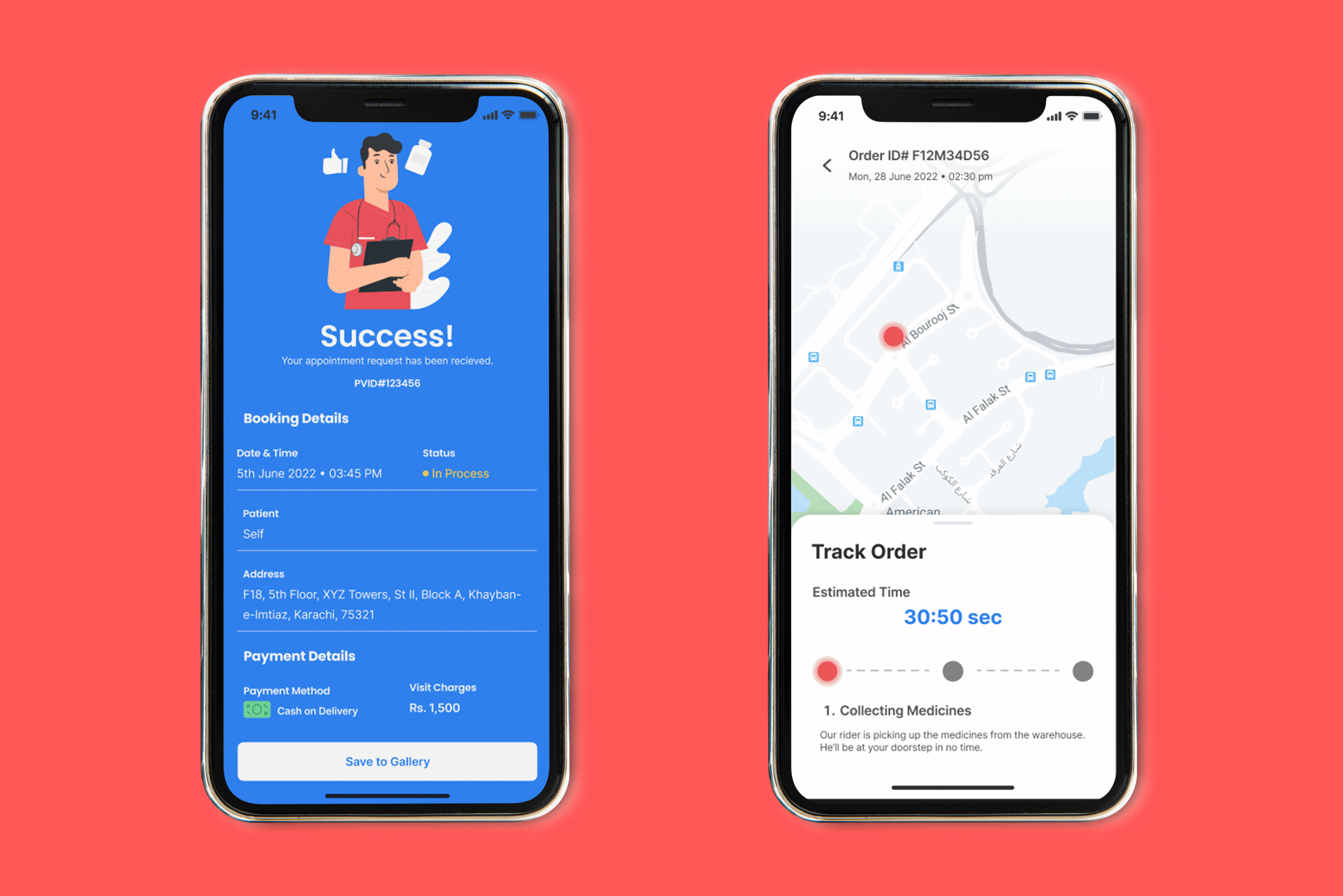
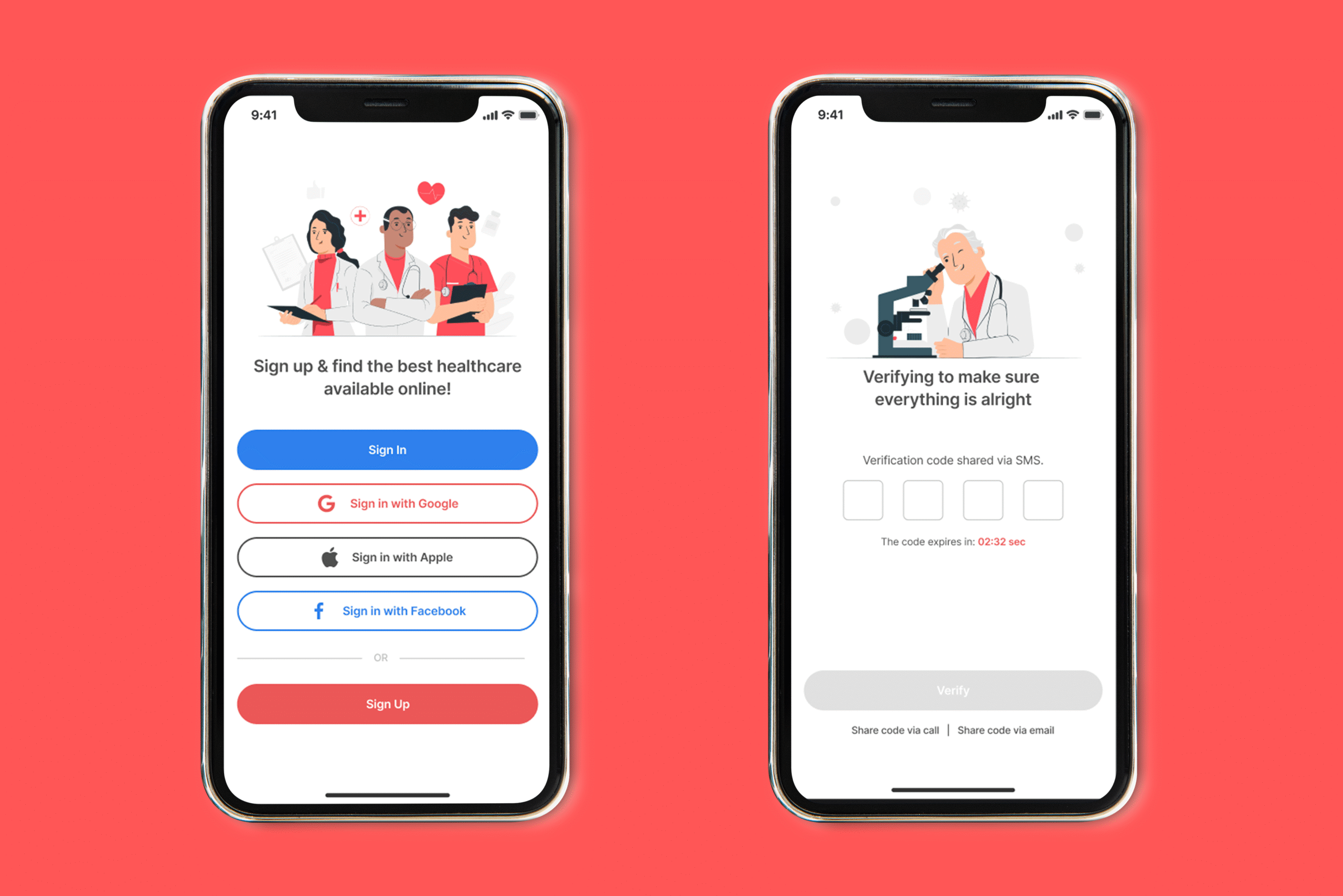
Our Solution
An app that heals the experience.
The final solution was a completely reimagined app experience. Clean layouts, simplified flows, and calm visual design replaced the previous clutter. Key services like consultations, pharmacy deliveries, and follow-ups were integrated seamlessly.
The redesigned app not only improved usability but also strengthened trust. By aligning healthcare values with digital design principles, Find My Doctor emerged as a leading health-tech brand with an app that was intuitive, empathetic, and impactful.