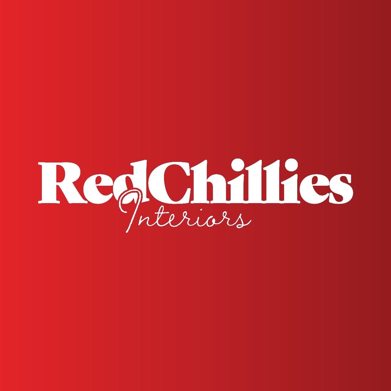
Red Chillies Interiors is a Dubai-based design studio that stands out for its bold and playful approach to interiors and architecture. Inspired by creativity and confidence, the studio aimed to create spaces that were expressive, memorable, and full of character.
As a boutique firm in a highly competitive design market, Red Chillies required a brand identity that reflected its unique vision. It needed to capture its bold essence while appealing to clients who sought originality and daring creativity in their spaces.
01.
Problem
Bold ideas, bland branding.
While the studio had strong design capabilities, its branding lacked coherence and distinction. The absence of a clear identity diluted its positioning in a crowded interior design industry dominated by established players with polished narratives.
Without a unified profile, Red Chillies risked being perceived as just another design studio. Its playful and confident ethos was not being communicated effectively, which limited its ability to attract clients aligned with its creative spirit.
02.
Our Synthesis
Playful yet professional.
We synthesized Red Chillies’ brand essence into a system that balanced playfulness with professionalism. The identity needed to be bold enough to stand out, yet structured enough to inspire trust.
By blending spice-inspired storytelling with confident visuals, we created a brand system that reflected both personality and credibility. This synthesis positioned Red Chillies as a studio that embraced creativity without compromising on design authority.
03.
Ideation
Turning spice into style.
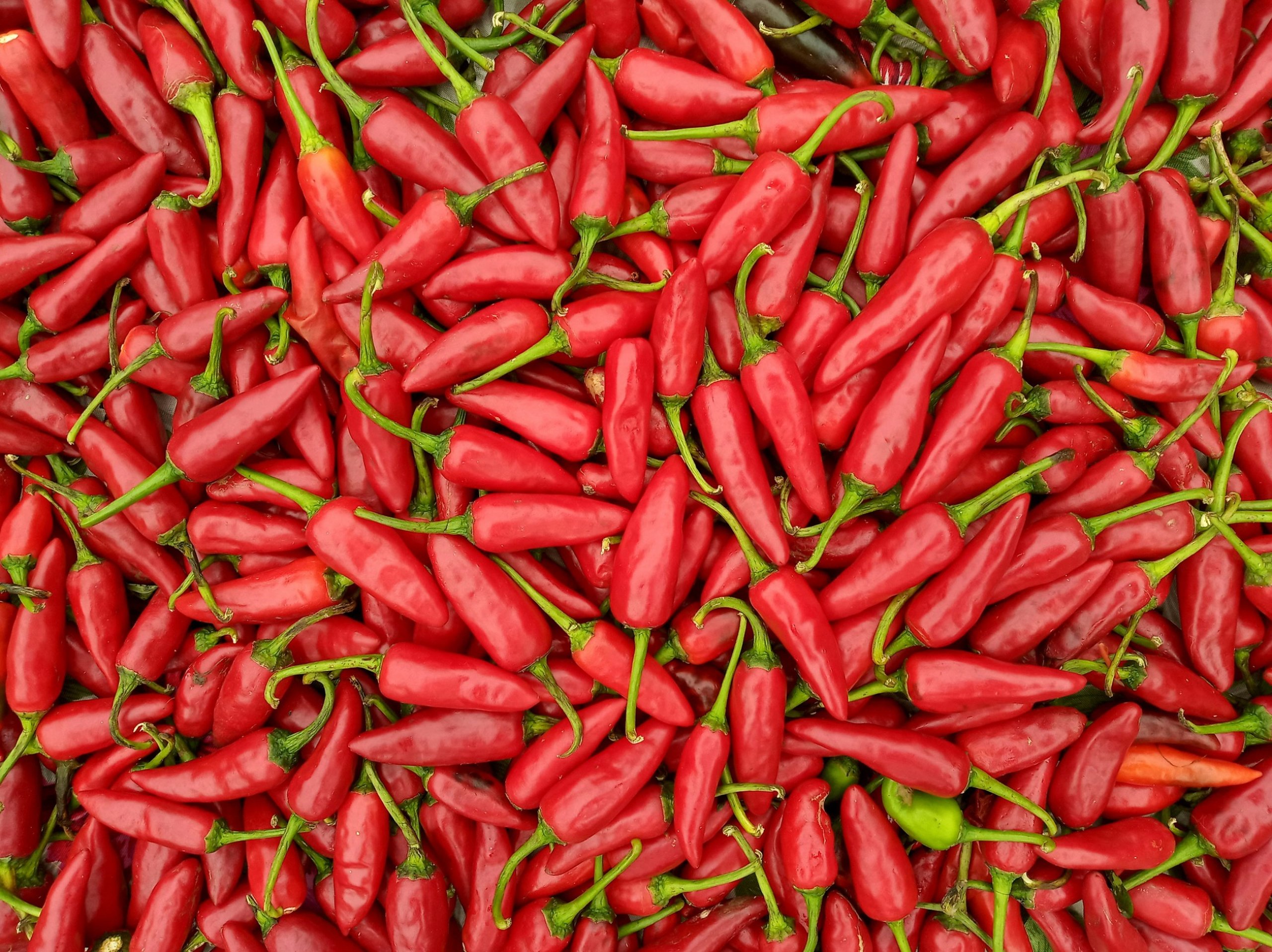
Our ideation explored vibrant visuals, bold typography, and narratives centered on creativity as spice — an essential element that transforms the ordinary into extraordinary. The name itself inspired a thematic direction rooted in energy and zest.
We also imagined stationery, profiles, and digital content that extended this playful confidence across all touchpoints. Concepts revolved around celebrating design as an expressive art form, emphasizing the studio’s role as a creator of bold experiences.
04.
Experimentation
Color, confidence, and tweaks.
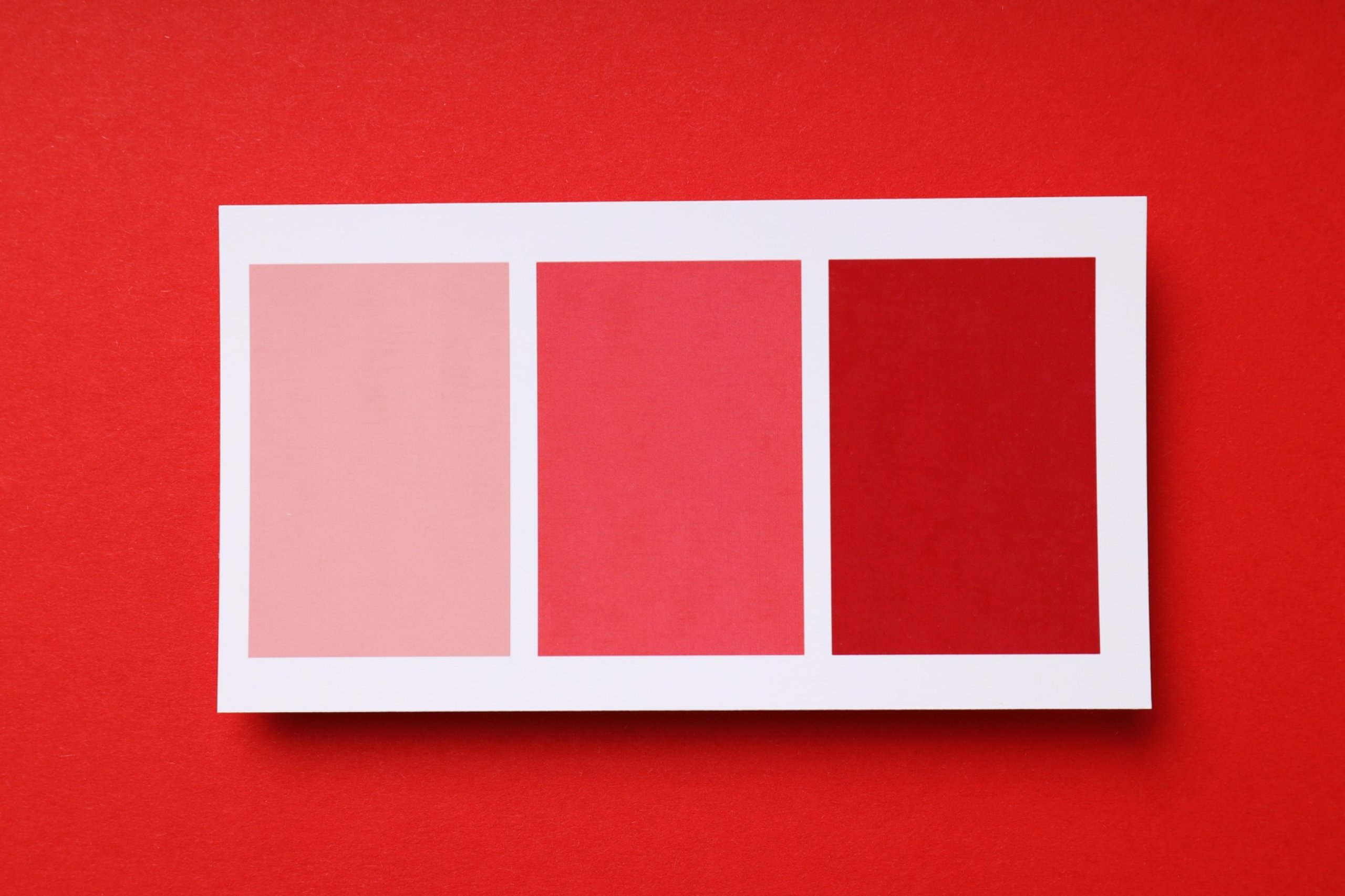
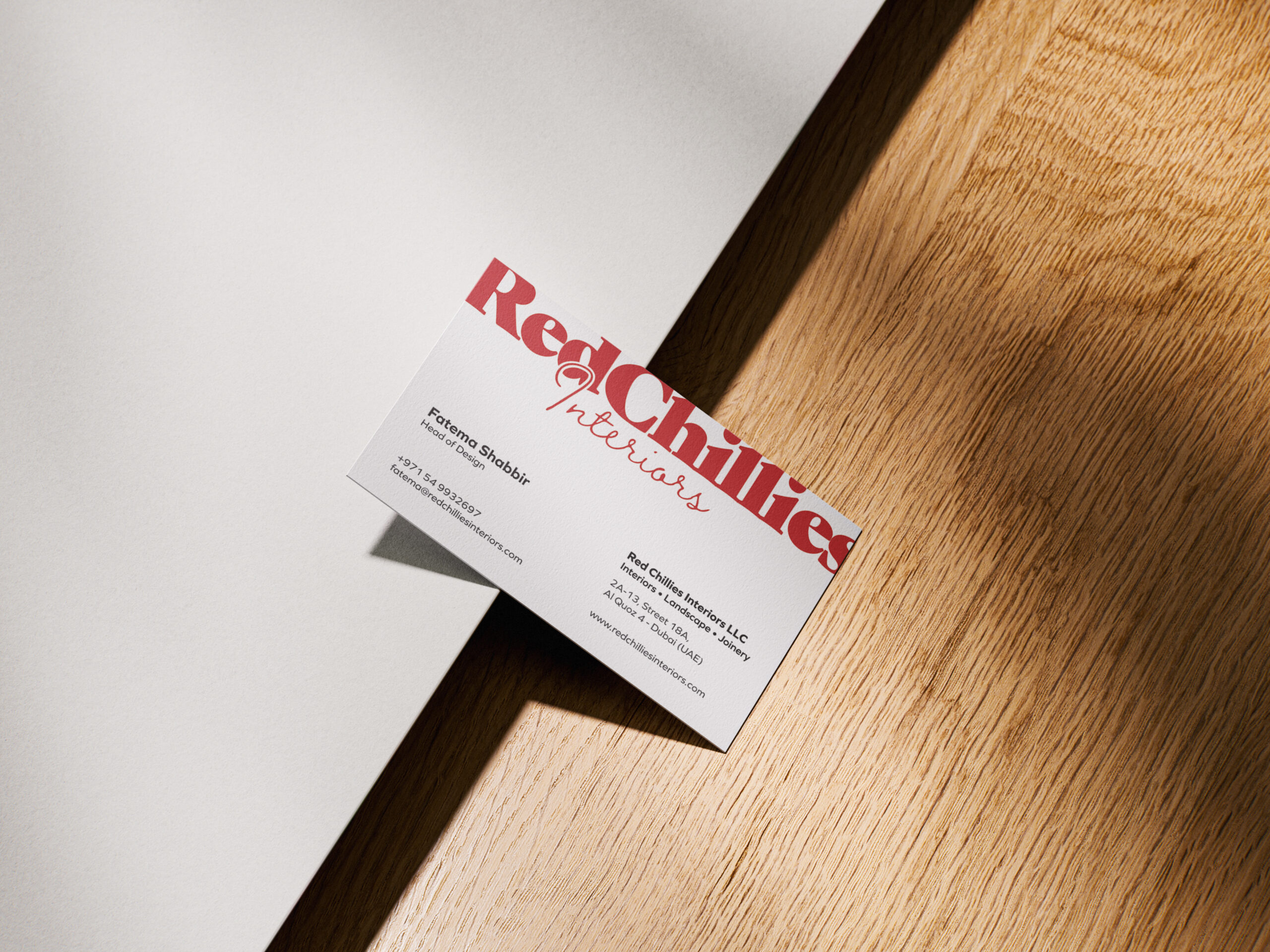
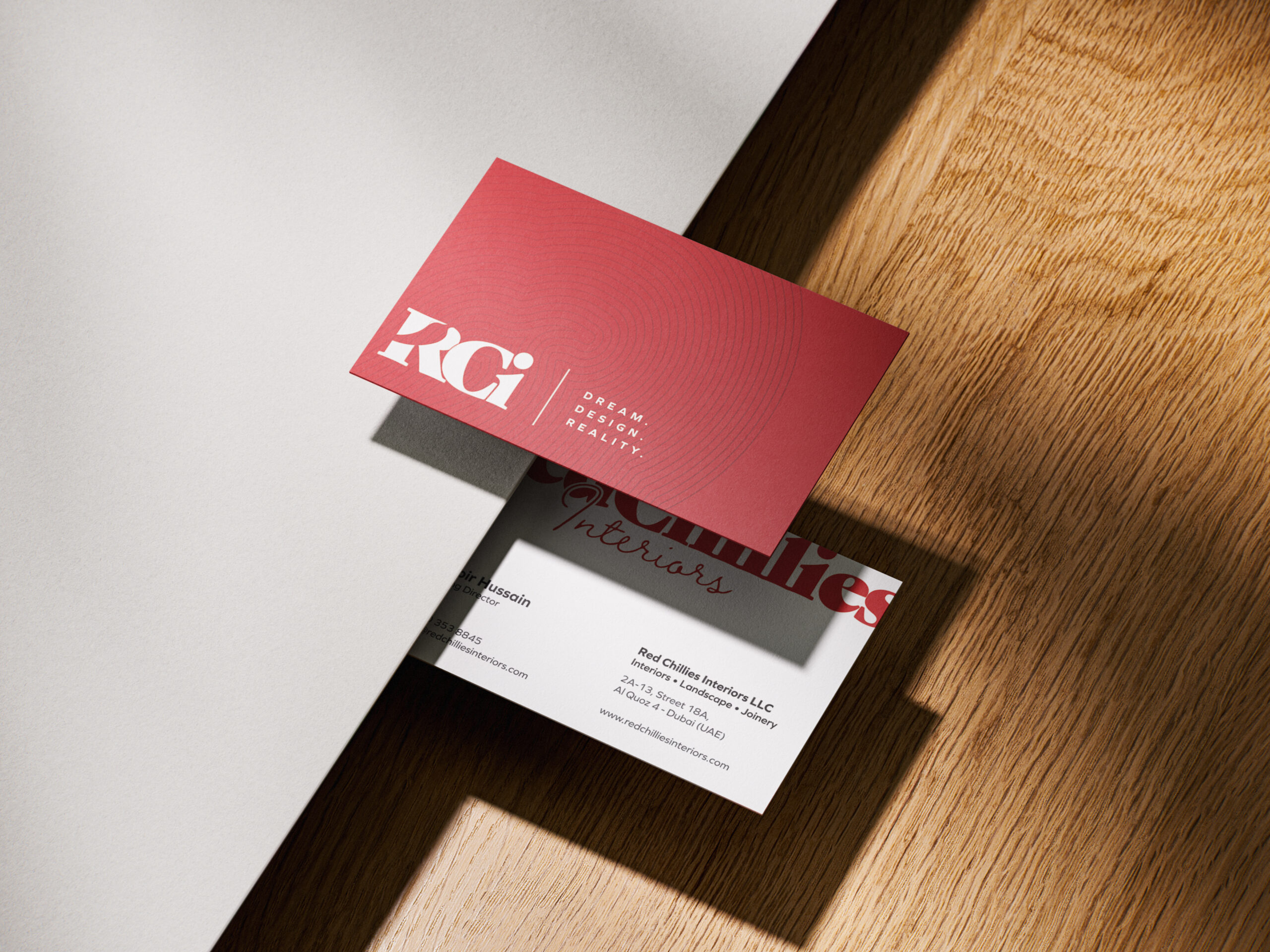
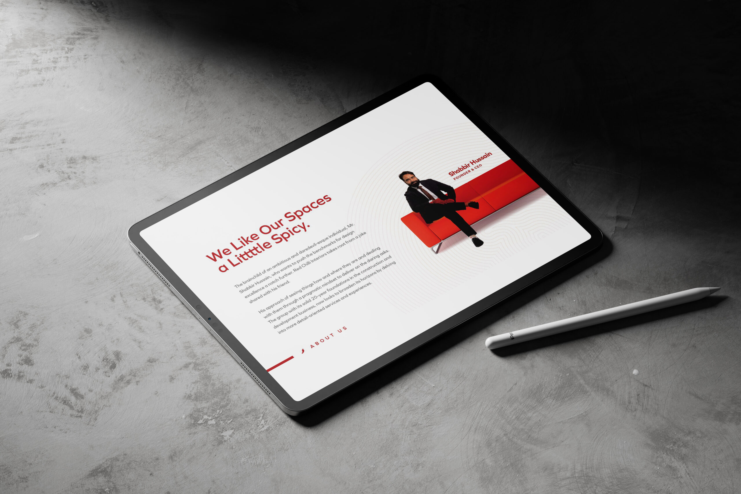
Prototypes tested the vibrancy and adaptability of the brand system. We experimented with different visual palettes and motifs inspired by spice and creativity. Mockups for profiles, stationery, and collateral assessed coherence across mediums.
Experimentation also extended to narrative positioning. We tested how bold, playful messaging resonated with target audiences. The iterative process helped fine-tune the balance between expressive creativity and professional credibility.
05.
Our Solution
Interiors with heat and heart.
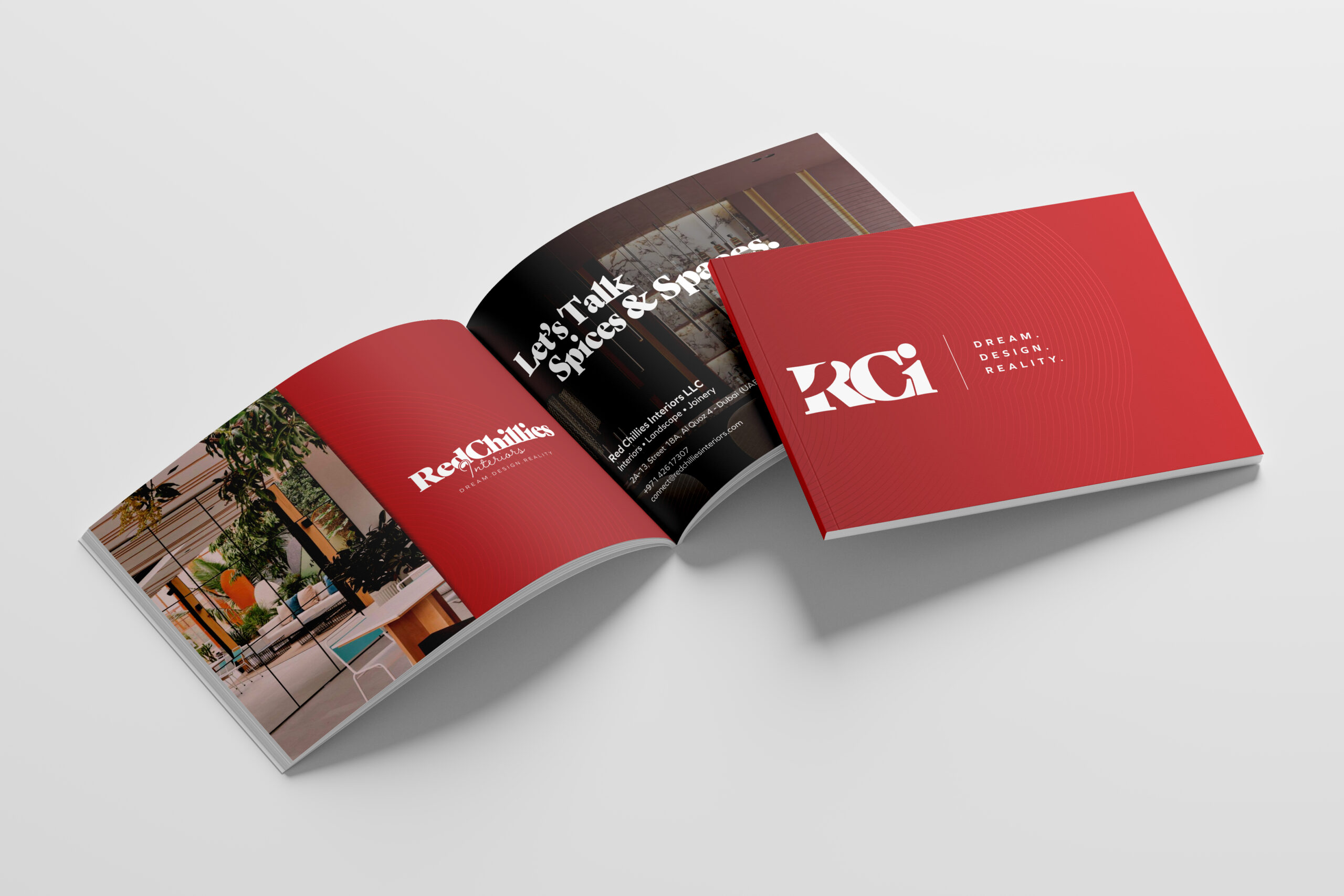
The final solution was a brand identity that captured the essence of Red Chillies Interiors. A vibrant visual system, confident typography, and narrative profiling emphasized boldness and creativity.
From profiles and stationery to digital touchpoints, the new brand system communicated character and confidence at every level. Red Chillies emerged as a distinctive design studio with a personality that was playful yet professional — standing out as a bold voice in Dubai’s competitive interior design landscape.